Rocket Matter
Helping a legal firm define their design strategy through iterative enhancements and innovative breakthroughs.
Client: Rocket Matter
Role: Contract UX Design & Research
The project
Rocket Matter, a legal practice management software, brought me in as a UX Consultant to help them create their first tablet based application. They had a successful web based application and iPhone app at the time, but it was becoming dated and users complained it was often unintuitive. Through upfront research and iteration I was able to deliver on a number of actionable insights and innovations that aided in the success of the product refresh.
My role
They wanted recommendations on how to improve the experience of the product and a fresh approach for the tablet that could translate to mobile and desktop. They didn’t have any UX or design resources, therefore I needed to provide research as well as design. I worked closely with Head of Development, product managers, and the customer support manager to set a strategy. Then with their front end development and visual designers on execution.
Setting the strategy
I started by setting forth some questions that I wanted the research to answer
What do users like and dislike about the current desktop and mobile applications?
How does the product fit into an attorneys ecosystem, and are there any needs being missed?
I conducted a number of upfront research activities and data mining including:
- Reading public forums, blog posts and software review sites, regarding this and competitor software.
- Interviewing customer support reps and reviewing call logs
- Analyzing NPS feedback and comments
- Reading through account cancellation survey response data
- Interviewing attorneys who do and don’t use the software
- Interviewing stakeholders to better understand the company and their goals
- Competitive analysis of the top three vendors
- Online usage metrics
For the focus of my work their primary user was the solo attorney:
“There are about 1.2 million attorneys in the US, with about 800,000 practicing. Most of those are in companies with 10 people or less. Our primary client is the solo attorney.”
Key takeaways
Insight #1
The word unintuitive seemed to be repeated everywhere. Users liked the software and its base functionality, but they had trouble navigating and learning it.
Insight #2
Attorneys had a hard time getting a high level overview of their practice. Rocket Matter was unique in the industry being matter centric as opposed to client centric, but the current structure required a lot of digging.
Principles
I was able to setup 5 overarching principles from this research, to guide the direction of my work and future recommendations. The principles outlined a design strategy and were prioritized:
- Design Aesthetics - focus on bringing the design into current trends
- Information Organization - revamp the structure to avoid needless digging and easy movement
- Intuitive Interactions - focus on common web patterns and simplified interactions
- Interface Efficiencies - reduce complexity where possible by providing good defaults and shortcuts
- Holistic Lifecycle - ensure the product fits within the users ecosystem through multiple stages of a case
Analysis
I was able to create some clear goals from this research including; improving product design consistency, simplifying navigational flow, and adding a practice dashboard to give users better overall visibility to their work.
In the current application when drilling into a case the user would lose their top level navigation in place of a matter centered navigation. I did some quick analysis of the desktop and iPhone applications, as well as some competitive analysis and flows, to make the structure more approachable and maintain a top level navigation.
Design
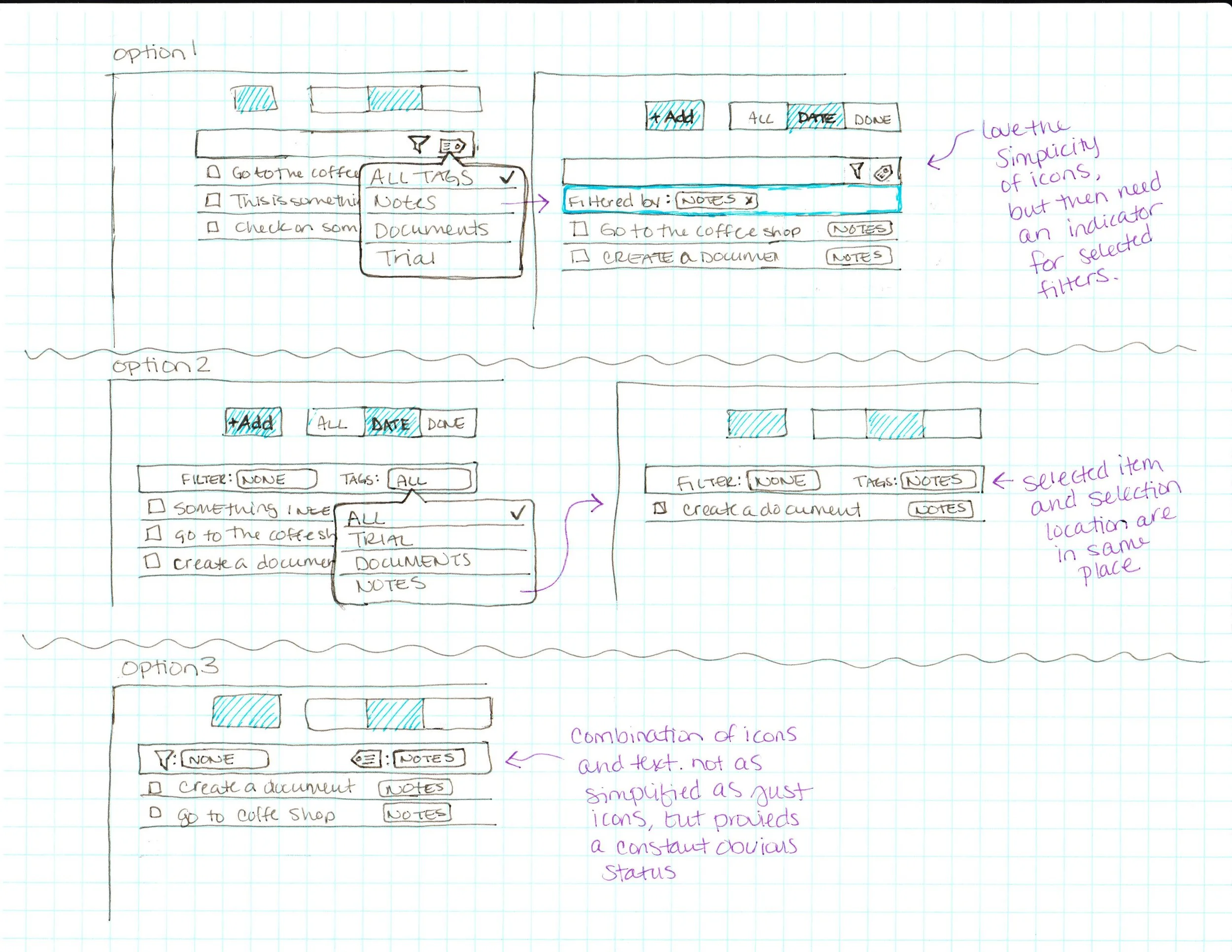
Once I had the navigation set I began working page by page on the updates. I went through a few rounds of sketching, getting into detail around the micro interactions of the elements. I wanted to be sure that the nuances of use were intuitive and functional. For each page I worked through the patterns and states of each of element.
When I started feeling good about the direction I ported my designs into a rough Axure mockup to do some usability testing. Knowing flow was an issue with the current product, I wanted to ensure the new designs would pass an interactive test before sending anything on to development.
During the studies I began to uncover a missed opportunity in the product around time tracking.
“Many days I’d work a long day, working on 5-10 clients (all different matters) and having virtually nothing to show for it on a timesheet. That feeling is one of the worst you can have, short of screwing up professionally. When things get crazy with clients calling, all with emergencies time-tracking just takes a back seat.”
Innovation
The majority of time tracking was happening retrospectively because of the way attorneys need to work and handle interruption. Time tracking often happened all at once at the end of the day, which resulted in many chunks of time and client interruptions not being accounted for, resulting in financial losses. I reexamined how time tracking worked in the product and delivered an enhancement to the design that included a new multi-function timer.
“I really like the multiple timer function, it makes timekeeping more efficient.”
Completion
Updates were made to the interface to improve usability and intuitiveness. Designs were finalized and provided to the team, along with a strategic deck; outlining the principles followed, research learned, and recommendations for future improvements.


