Red Zone
Design-A-Thon that encouraged us to tear down the app and create a better solution.
Client: Red Zone
Role: Competition Participant

UX+Dev Summit Design Challenge
RedZone challenged attendees of the UX+DEV Summit to a Design-A-Thon, to breakdown and improve their crime data app. The challenge details were announced on the first day of the summit, but it wasn't until day three that a co-worker challenged me to take part.
Preliminary analysis
I downloaded the app to learn more about it, read over the company mission, and evaluated the interface. My goal was simple UX/UI improvements, and updates that would enhance the value of the current app.
I took a little time to brainstorm around behaviors, triggers, and rewards:
- What encouraged someone to use this application?
- What would trigger them to open it?
- Why would someone download this app in the first place?
- How frequently was it used?
The application provided crime information on request, but did not include any proactive notifications or triggers.

Hallway research
I've personally been a victim of a burglary, and knew this app could be more useful if it were more proactive. Only after I had been burglarized did I learn there had been several break-in's in my neighborhood earlier that week. Had I known, I would have been more proactive about the security of my home. How could this app help? I did a little hallway research with other folks at the conference to hear their stories and validate my assumptions.
Innovation
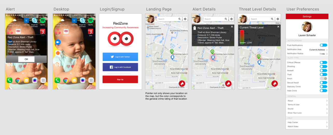
The current application allowed users to view crime by location and filter by type of crime. But what if a crime was taking place near the user, how would they know? What if it was near their home while they were away? Taking this into account I created a settings area for alert notifications by type, as well as a notification radius feature. This allows users to set a default location and radius, in addition to their current location for notifications, informing them if dangerous crimes are committed in a designated zone, even if they are away. This idea could be expanded upon further by allowing users to setup multiple locations of interest.
Design
Sketching commenced and I quickly moved into Adobe XD, with a looming deadline I needed to have something flushed out and demonstrable quickly. By using Adobe XD I was able to create quick hi-fi mockups and link them together with their prototype tool for an interactive demo.
I focused on subtle but important enhancements. For example with the map screen:
- The existing app lacked a way to search for specific locations. For users to see crime around a university, for example, they would have to zoom out from their current location, scroll across the map and zoom in again. I added a search box at the top of the screen.
- Icons were tiny and hard to differentiate. I increased their size, and added a pin for the users current location, that changed color based on the threat level at that moment in time.
- The vital 'Report an Incident' button was easily lost, so I gave it a prominent color and simplified the icon.
- I designed information layovers, as the existing design panels obstructed the entire map when details were shown.
Before

After

Additional enhancements included opt-in push notifications for dangerous crimes near the user, and a simplified sign up page that allowed social media sign in.
Video demo

Awards
I finished in the top 3 with my simplified UI, notification radius and alert features, and general improvements to the flow.
Solutions were judged on:
- Ideation and concept
- Process and approach
- Wireframes, drawings and/or prototype of the user interface
- Solution
- Presentation